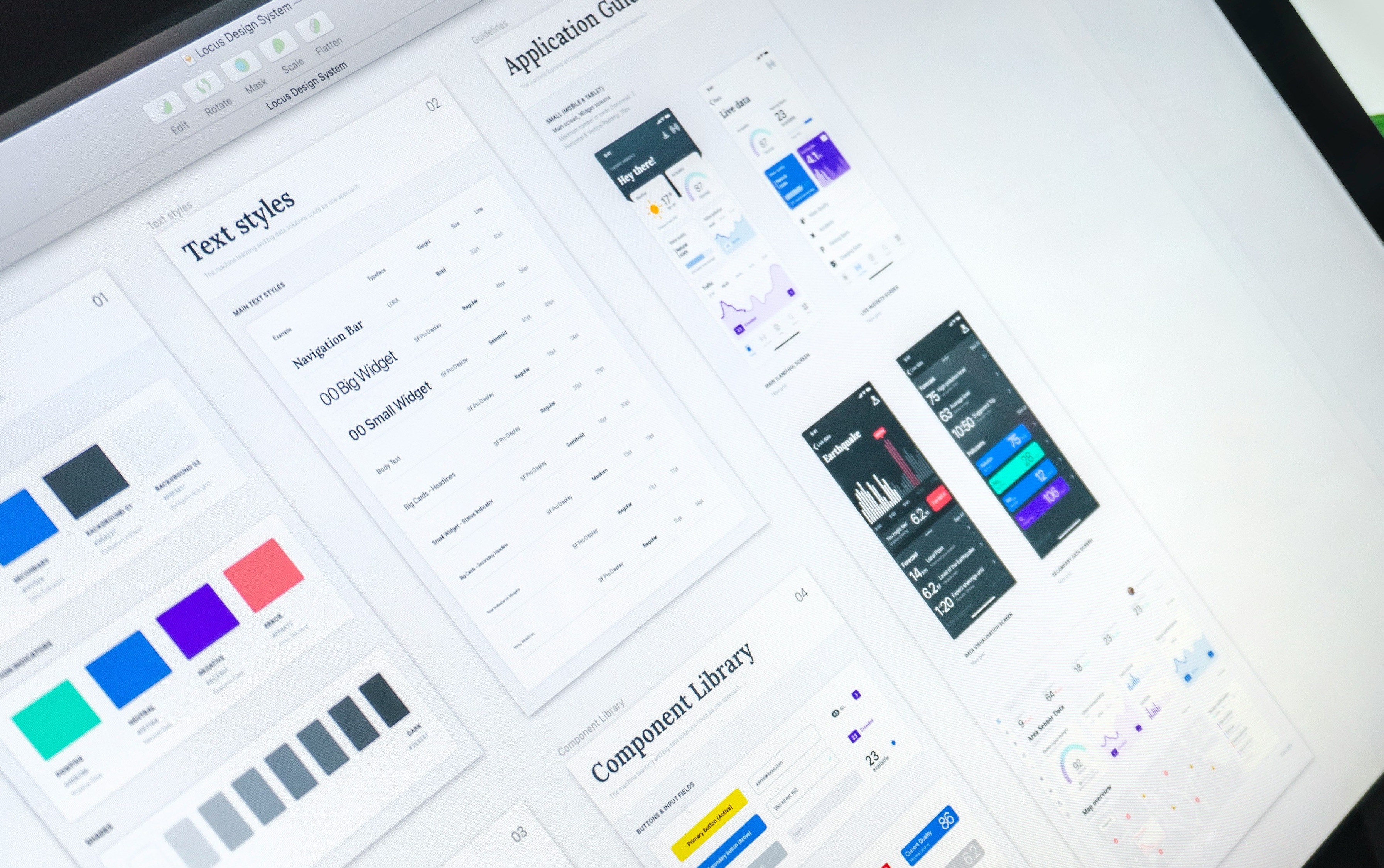
A unified visual language across the QliqChat B2B portal, ensuring a seamless user experience. Problem Statement: Inconsistent Design Across the Product: Variations in layout, button styles, spacing, and typography have led to a fragmented user experience, undermining the overall usability and visual appeal. Uncoordinated Feature Development: Features developed by different teams at various times lack uniformity, resulting in a disjointed interface and increased maintenance overhead. Inefficient Development Processes: The absence of reusable components has caused significant time loss, as developers often rebuild similar elements from scratch for each new feature, impacting productivity and delaying releases.
Client:
QliqSOFT
My Role:
UI Designer
Year:
2024
Tools used:
Figma, Framework - Element Plus
Service Provided:
B2B, Enterprise Design
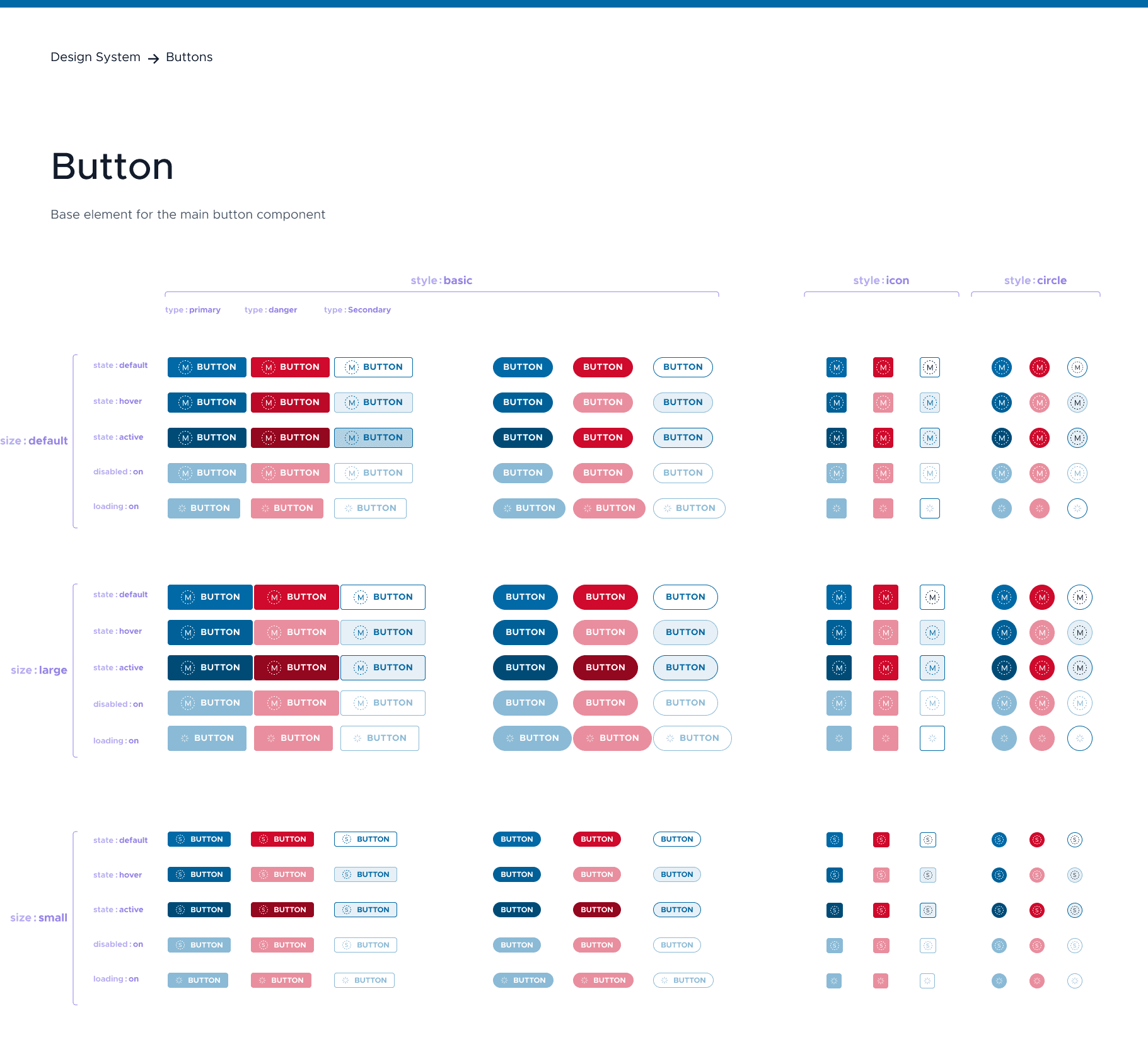
The button component is a fundamental interactive element used to trigger actions in the interface. It provides a clear call-to-action (CTA) for users and adheres to accessibility and usability standards.
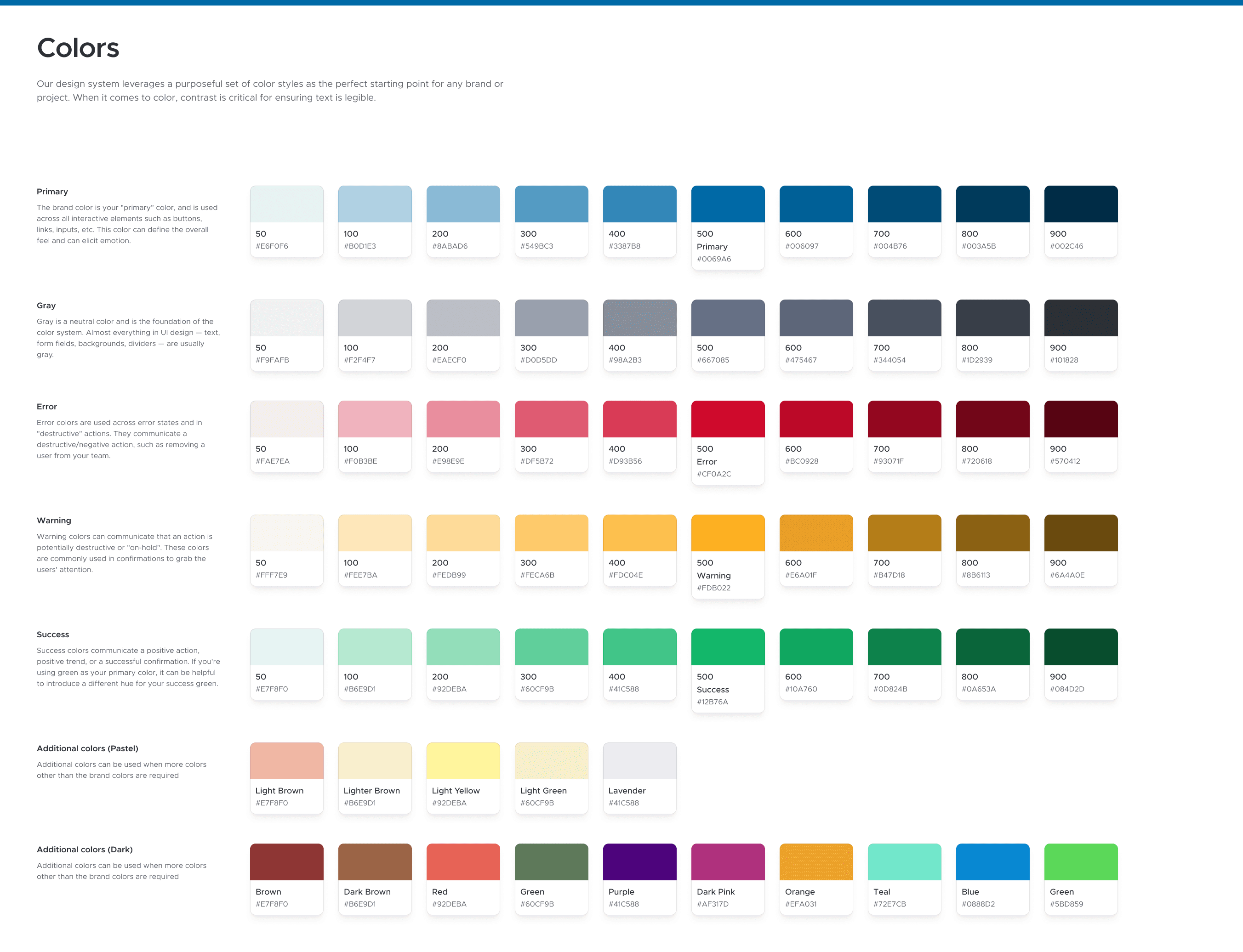
A well-defined color system ensures consistency, accessibility, and scalability across all components and screens in qliqCHAT.
The design system improved
Findability in UX
Users can easily locate the information, features, or functionalities they need within qliqCHAT. I believe a product with good findability minimizes frustration and maximizes efficiency, ensuring users can accomplish their tasks without unnecessary delays.
Reduced Development Timelines
Reduced repetitive coding tasks and allowed development team to focus on implementing functionality
Comparison
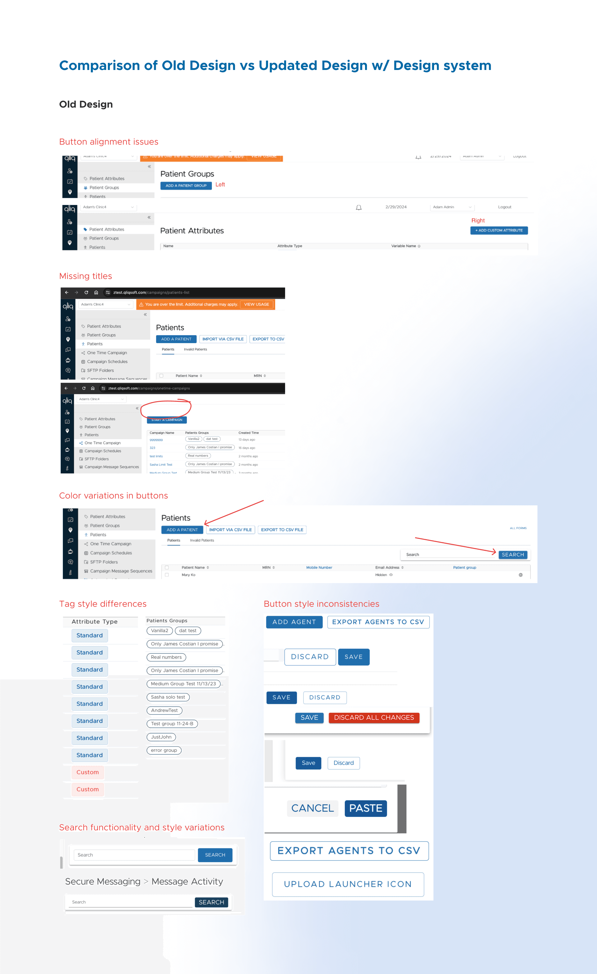
Old Design
Part of my design process was to review the inconsistencies in the User Interface.
Review documentation: https://docs.google.com/document/d/1bVVDZ9QHV_k_z6p1GdixQQvk2o6dRu8r7NsXdaT_RZc/edit?usp=sharing
Review Highlights
Button alignment issues
Missing titles
Color variations
Tag style differences
Button style inconsistencies
Search functionality and style variations… and more
Current Template Design
After a thorough review, the primary and unique template screens were constructed using library components. This approach ensures that developers are well-informed about the information architecture and layout consistencies across all modules.
Figma was utilized as the primary tool, leveraging its Auto Layout feature to build templates with reusable components. This setup facilitates future updates, enabling any designer to make changes efficiently and maintain consistency.
Sample Prototype of Visit path module: https://www.figma.com/proto/9fQMuZV0V7x7Y3z9ERRMqL/qliq-Design-System?page-id=617%3A5317&node-id=646-44370&viewport=4077%2C740%2C0.88&t=lHnh7KX02MpNXWab-1&scaling=scale-down&content-scaling=fixed&starting-point-node-id=646%3A44370