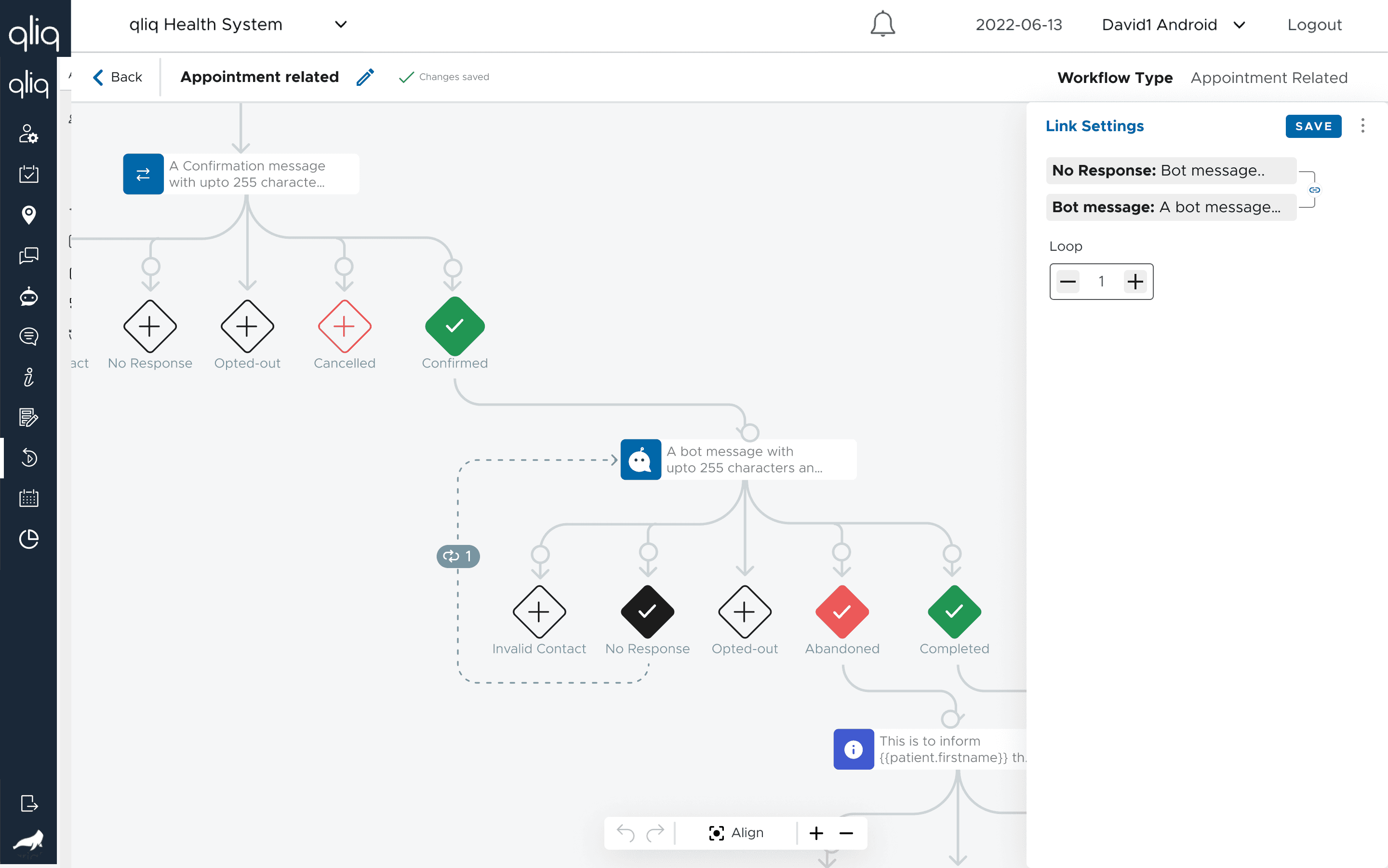
Providing the administrators in hospitals, the power to create the care campaigns, chatbots, messaging groups, virtual conversation and more using in-built features.
Client:
QliqSOFT
My Role:
Product design and new feature implementation strategy
Year:
2021 - 2024
Tools used:
Figma, Adobe XD, Slack, Gitlab
Service Provided:
UX/UI Design, Mobile Design
Problem Statement
The current web app is used by the administrators in a hospitals and clinics. They create the care campaigns, chatbots, messaging groups, virtual conversation and more using in-built features.
Inconsistent UI
The UI had many inconsistencies and as a result the users were finding it hard to recall the usage of UI elements like buttons, input boxes and more. Did an UX audit and presented my review to the CEO, project manager and developers. The main issues were
misplaced UI elements like buttons, checkboxes, input boxes, forms in each feature module
modals didn't have a specific style and was different at many instances
New Feature Implementation
To be par with the competitors, the features were upgraded with new features.
After eight months of design and development work, the app was launched, and the results have been impressive. User engagement has increased by 30%, with an average of 15% more time spent on the app by users. Additionally, the team has reported a 20% increase in app downloads and a 25% increase in in-app purchases.